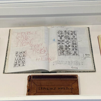
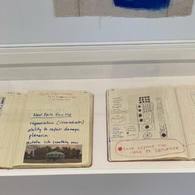
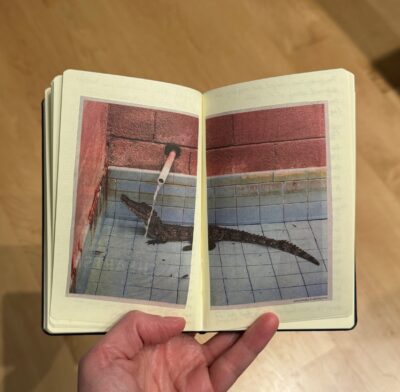
A few years ago, I went to an exhibition of art by Karla Knight, but for some reason have never gotten around to posting about it til now. Her work is very interesting, full of strange symbols and spacey-looking shapes. But of course I was especially intrigued since some of the exhibition included notebooks! I snapped a few photos of these drawings done in what seemed to be old ledgers, composition books and lab notebooks.
There were also large scale paintings and drawings, so I think these notebooks were just preparatory sketches but I love them just as they are!
You can see more of Karla Knight’s work on her website.
If you’d like to see notifications about my posts on Bluesky, now you can! I just realized dlvr.it had stopped posting my updates to Twitter-I-mean-X and Facebook about a month ago, so it seemed like a good time to jump on the Bluesky bandwagon. I probably won’t be posting very actively but there will at least be notifications when new blog posts are available, assuming I’ve got Zapier working correctly!
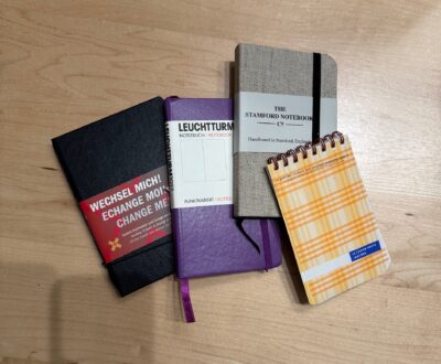
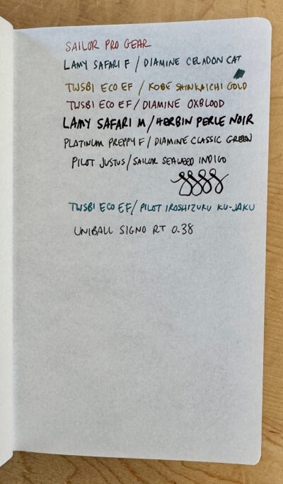
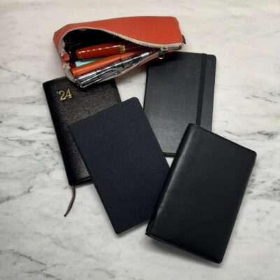
Here’s a some random notebook photos just for the heck of it.
It’s been a long time since I embarked on any crazy notebook modification adventures. But every once in a while, I get a bee in my bonnet about a notebook that is just soooo close to perfect except for this one little thing… and if it seems like something I might be able to fix, I am compelled to try it.
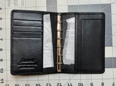
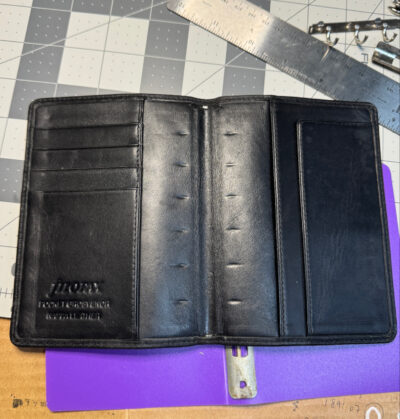
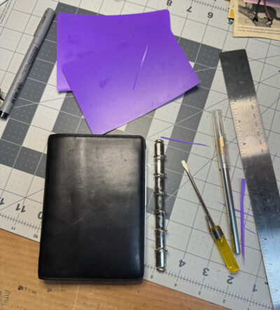
This time, it involved an older Filofax, a pocket Grosvenor from 1999 that I bought in excellent second hand condition. It’s made of a gorgeous soft leather and has nice pockets and is pretty much perfect except that it’s wider than my preferred shape. It also has very small rings (11mm). It reminded me a lot of my two pocket Chelsea Filofaxes, one of which has small rings and one which has larger rings (about 17mm). The extra thickness added by larger rings makes the cover of the Chelsea less wide when it’s filled. And I also had it in mind to use as my new work notebook, where the larger capacity would be needed. So I started thinking of how I might be able to swap out the rings in the Grosvenor.
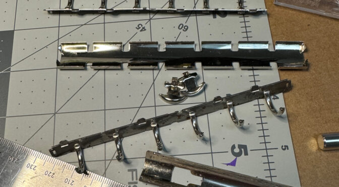
Filofax pocket sized organizers with the small rings have small metal tabs that hold the rings to a backing plate under the leather. Although my pocket Chelsea uses the same attachment tabs for its larger rings, I haven’t been able to confirm whether any other Filofax models used this method for larger rings. Most pocket size organizers use a different method where two little brackets on the backplate slot into the base of the ring mechanism, or they have two rivets that go all the way through the cover, attaching it permanently.
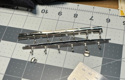
I thought I might still be able to attach a set of larger rings from an older pocket Filofax, so I bought a cheap old grungy one just to use for parts. I could also have just bought a set of brand new Krause rings from various sources, but it was good practice to remove the rings and cut the cover open to remove the backplate. Unfortunately I didn’t take pictures of that operation! But it led me to discover that the base of the larger ring mechanism is a different length– too short to allow the backplate tabs on the Grosvenor to hold onto it. Most Filofaxes with small rings have a 13cm backplate, but the ones with larger rings are around 12.5cm to 12.7cm from what I’ve seen.
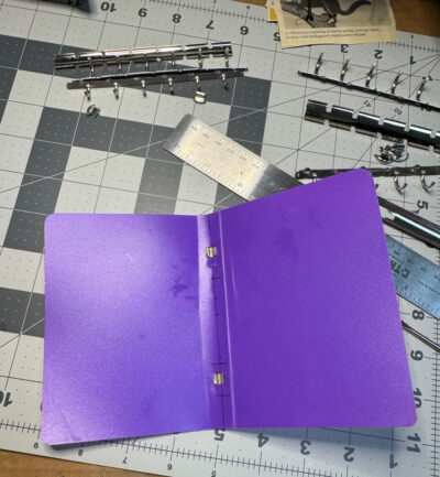
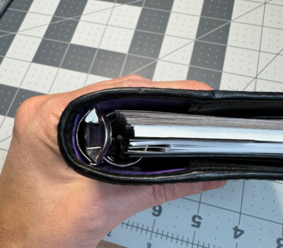
I couldn’t see how I could possibly come up with a way to lengthen the base so it would reach the tabs, or lengthen the tabs to meet the base. I almost gave up on the project. But I decided that the next best thing would be to attach the rings to a thin sheet of plastic and then insert that in the Grosvenor’s pockets. I have another notebook in my collection that was actually made this way, in two separate pieces so the rings and the plastic inner cover were separate from the leather exterior cover–which I promptly swapped for a different one.
For Grosvenor project, I used a plastic folder that I happened to have at home, measuring out the size, and marking where the holes for the brackets of the ring base would need to go. With a little fiddling with an Xacto knife, it actually came together pretty well!
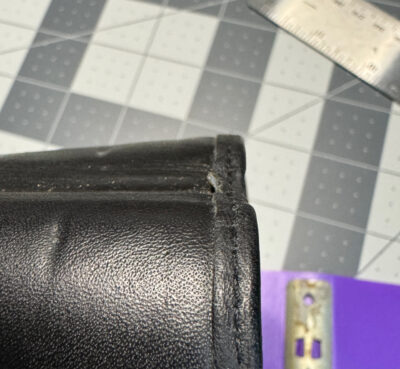
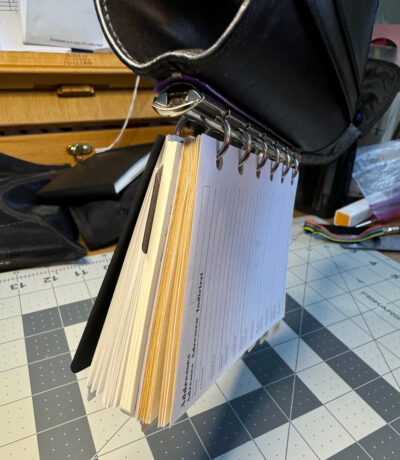
I then had to remove the small rings that were in the Grosvenor. I used the same method of taking the rings apart, but found it more difficult due to the small size of the parts. No matter what size the rings are, the metal pieces have rather sharp edges so you really have to be careful!
When it was time to try to pry the tabs open a bit to release the base of the ring mechanism, I heated them up a bit with a hairdryer, in the hopes that the warmth would make the metal a little more soft and flexible and less likely to break. It was hard to get my little screwdriver under the tabs, but I eventually managed to loosen one of them enough to be able to slip the ring plate out.
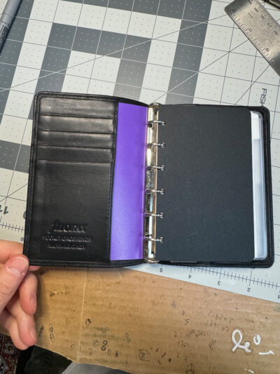
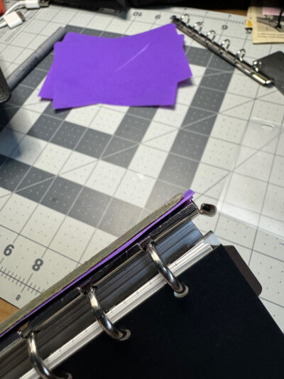
Then it was time to insert my plastic ring holder, but once I fitted it into the leather cover, I realized there was a problem– the plastic didn’t want to stay bent and the organizer was flopping open. I took the plastic out and folded it along the spine, which helped, but it still wasn’t quite right. (It’s Not Right But It’s Okay was running through my head the whole time!) I trimmed the edges a bit more, and trimmed some bits of plastic that were sticking out on the back, but it became obvious that this just wasn’t going to work very well. It was also really ugly having all this purple plastic inside my beautiful Grosvenor! Not okay at all.
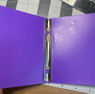
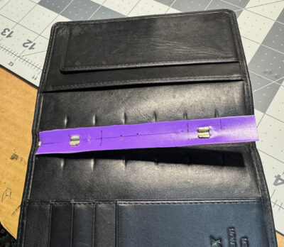
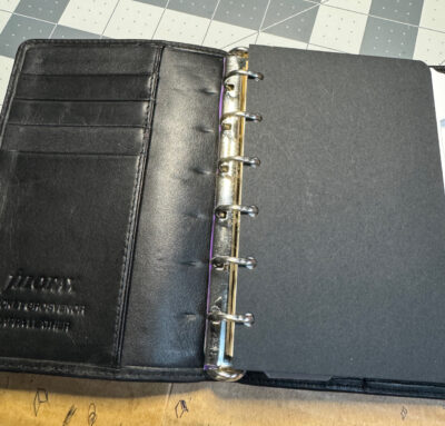
So I tried one more thing: I sliced the purple plastic covers away completely, leaving only the spine part that was sandwiched in the ring mechanism– this piece was actually the perfect length to fit under the backplate tabs. And sure enough, when I carefully pressed the tabs back down again to hold it in, it actually worked!
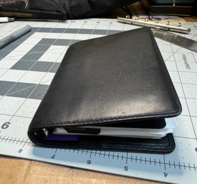
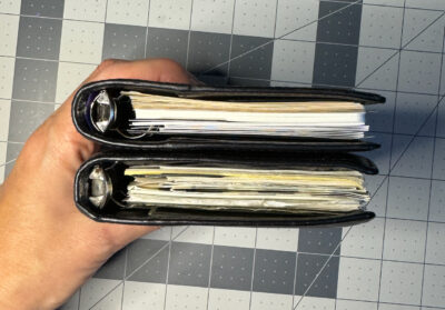
The rings seem to be held in pretty securely, and I now have a Grosvenor with larger rings. It still might not be exactly right, but it’s more than okay! The subtly different proportions are more to my liking and it has a nice chunky feel like my old Chelsea, with tabbed dividers just barely fitting inside the cover. Since there’s an extra layer of backplate, things are pushed a bit further out from the spine than they should be. For most inserts it doesn’t matter, and normal index tabs sticking out just a hair isn’t too bothersome. But unfortunately, the top-opening plastic envelope I wanted to add was too wide and stuck out quite a lot– the envelopes they sell now are a lot wider than the 1990s ones in my collection, which is annoying.
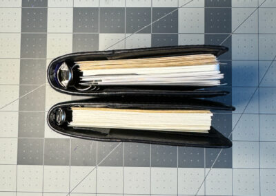
Modified Filofax Grosvenor on top, Filofax Chelsea on bottom.
On the downside, I can’t say I have total faith in this ring attachment method passing the test of time. It seems like the purple plastic could easily slip out or tear or wear out. But we’ll see how it goes. My intended purpose for this notebook may be mostly at-home use, so it won’t have to survive being tossed in a bag very often. If I decide it’s not working, I could almost imagine trying to open up the leather on the inside of the spine to see if I could swap out the backplate, actually gluing the wider one under the leather and then sewing it back shut… but I think that might be a more radical surgery than my nerves could handle! I’d probably just reattach the original small rings, praying that being bent back and forth again wouldn’t break the tabs. This whole project deserves a “don’t try this at home” warning, but I’d also say “don’t try this anywhere in public if you’re embarrassed to be seen crying!”
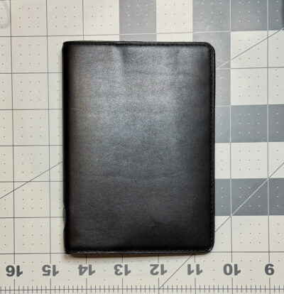
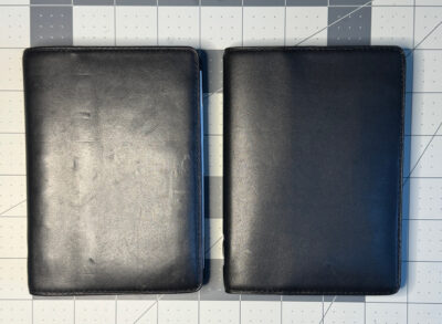
Now you might be thinking “how could she risk destroying such a beautiful and rare vintage Filofax?” Believe me, I struggled with this question too. If I broke the tabs and couldn’t attach any rings to it, the cover on its own probably could be used as a holder for passport-size notebooks, but still, it was really worrying me that I could potentially ruin a very nice item that I’d never be able to replace. That’s why I didn’t allow myself to do this Filofax modification until I’d miraculously managed to buy a second vintage Grosvenor in even better condition! That’s what I call a back-up plan.
Filofax Grosvenor: modified on left, original on rightFilofax Grosvenor: modified on top, original on bottom
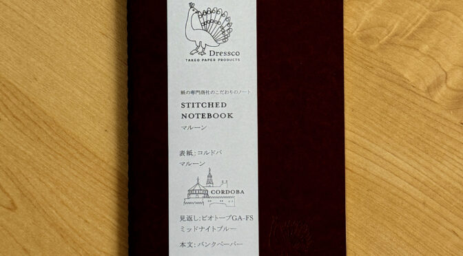
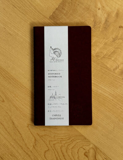
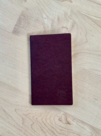
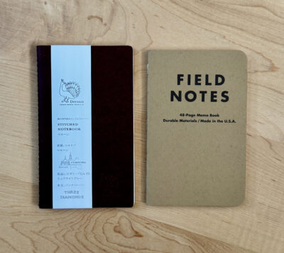
I have to confess that I bought this notebook mainly because I was feeling a little frustrated. I’d made a trip into NYC and was all excited to go to Goods for the Study and browse through lots of fabulous stationery… but then when I got there, I didn’t see anything that I really thought was new and exciting. “Been there, done that, meh,” is not a sensation that I want to experience in a stationery store, but I guess when you’ve been blogging about notebooks for 16 years and collecting them for 50 years, it’s bound to happen sometime! There are only so many ways to make a notebook new and exciting. But I felt like I couldn’t leave empty handed, so I decided to buy something lightweight and (relatively) inexpensive. I chose this Dressco Stitched Notebook.
It’s actually pretty adorable. The packaging is very elegantly designed (and mostly in Japanese). The shape is a bit unusual but it’s slim and pocketable, also quite elegant. And you can tell right away that like so many Japanese notebooks, this is made with a high level of attention to detail and quality.
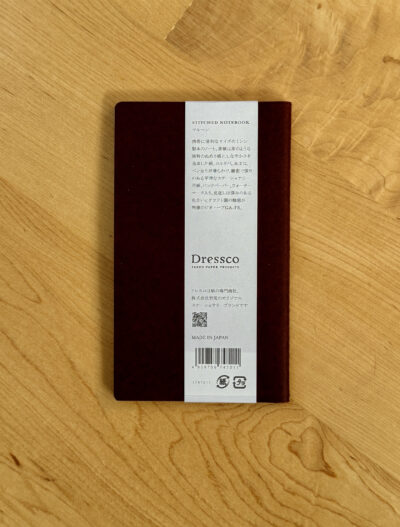
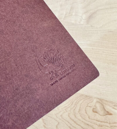
The outside of the notebook is a rich brown paperboard with a bit of a mottled tone to it. It’s not very thick but feels a little heavier than the usual cover of a Field Notes. The peacock logo that appears on the paper band is also blind stamped on the cover. The dimensions are “A6 slim,” 85 x 145mm, and about 5mm thick.
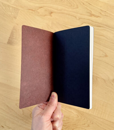
The cover wraps around a single signature of paper, held together by precise stitching running up the spine. Inside, there is one black sheet of paper at the front and back, and then 88 pages (44 sheets) of creamy white plain paper. I had trouble finding information in English about the paper, but I did see one online retailer describing it as “Ink-friendly MITSUBISHI Bank Paper.”
The paper feels smooth but not glossy-smooth like Tomoe River paper, there’s a little bit of feedback. And it is indeed ink-friendly! Show-through is a bit more than average because the paper is quite fine, but there is no bleed-through. I would love to see how this notebook looks when it’s completely filled with beautiful small handwriting in a variety of fountain pen ink colors– I’m sure the overall layered effect would be gorgeous.
So I ended up loving this notebook despite my jaded attitude when I bought it. Notebooks don’t have to be new and exciting to make me happy– precise construction, quality materials, and simple, elegant design will do the trick! I’d prefer that it was more in line with all my other 90 x 140mm notebooks but I’m willing to be a little flexible sometimes.
At $9.95, this Dressco notebook costs a lot more than a Field Notes or a Moleskine Cahier. But it’s an elevated writing experience, more in line with the Pebble Stationery pocket notebooks I reviewed. Those were $9.95 for a two-pack when I wrote about them in 2019, and are now listed at $10.95, though they are currently out of stock. Lochby’s Tomoe River pocket notebooks are $23.99 for a 4-pack. I can’t think of any other pocket notebooks that are as expensive per page/square inch as the Dressco Stitched Notebook, other than maybe Jet Pens’ A5 size Tomoe River notebooks. But if you want to save a few bucks, the best deal on the Dressco notebooks seems to be a 4-pack of assorted colors in a slipcase. The cover texture looks like it may be different, but they do say they have “bank paper.” And at the current price of $31.27 at Amazon, it’s almost a bargain!
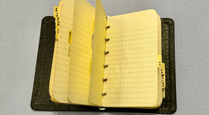
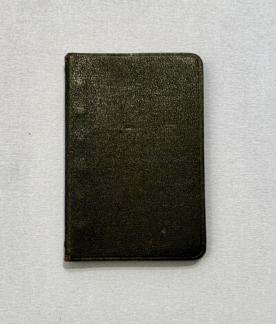
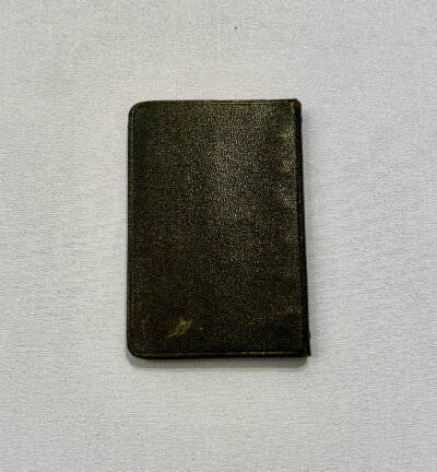
I just can’t seem to resist a certain kind of vintage notebook on eBay. I have bought several over the years, from various brands, in varying conditions and with various contents.
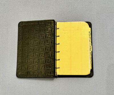
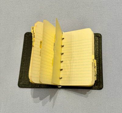
This one is quite adorable. It’s also quite fragile– the cover material (some sort of faux-leather material) is not very flexible, and the edges of the spine where it bends seem like they may be wearing out. Every time I open it, I’m afraid I’ll tear the cover off. Inside, it came with a set of alphabetical index tabs and some paper, but unfortunately all the pages are blank. I’m sure someone used it as an address book or notebook for quite a while, though, as it shows lots of wear and tear.
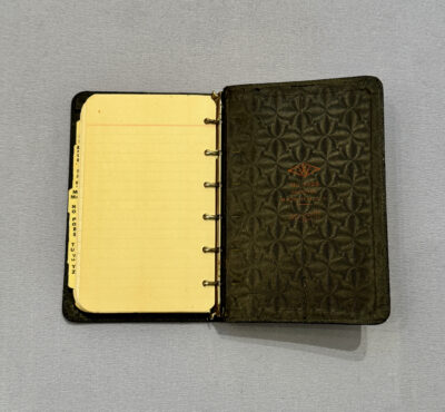
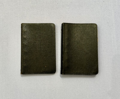
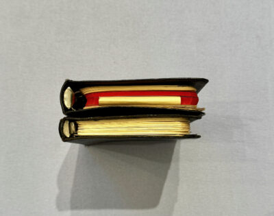
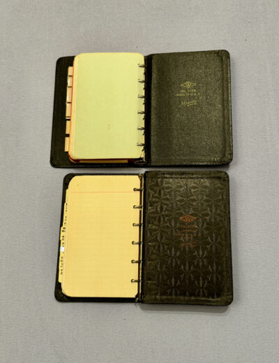
On the inside back cover, you can see the Marquette brand name, and the model number 1-126.
Interestingly, this is the exact same model number as the other old Marquette looseleaf I wrote about in this post. But I didn’t remember having a notebook exactly like this one. I had to dig out the other Marquette notebook to figure out why: these notebooks have different ring sizes, one being about 11mm and the other being about 15mm. The other Marquette notebook is thicker, and slightly wider to accommodate paper sticking out a little further from the larger rings.
Another difference between the two versions is the inside cover material. On this thinner notebook, it has a beautiful textured pattern, but on the other one it’s just plain black. One one, the logo is red, on the other it’s green. The thin one says “patented.” That and the textured endpapers make me think it must be older. The thin notebook has tabs for opening the rings at both ends, but the thicker one only has one tab at the bottom. Both notebooks’ ring mechanisms still work!
I guess Marquette either changed the design of the notebook at some point, or they offered the same model number in two different ring sizes. It reminds me of the mystery of my two Filofax Chelsea organizers!
There’s not a whole lot else to say about this one. It’s a charming little notebook, even if it doesn’t have any fascinating contents.
I have saved almost all the pocket size notebooks I’ve used in my life, except for the very earliest ones. I was drawn to small diaries and notebooks before I could even write, and the very first ones I remember using were Hallmark promotional diaries given away at the local drugstore– but I don’t have any of them anymore. It bothers me a bit that I don’t have any artifacts from this foundational part of my notebooking history!
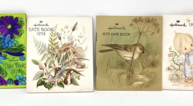
I’d never thought to google “Hallmark Diaries” until recently, but sure enough, other people saved those diaries and some have ended up for sale on eBay and Etsy. I’m pretty sure I must have used a couple of these exact ones shown below (from an Etsy listing):
Here’s another one that would have been from around my era:
The one below (from eBay) also looked familiar, though by 1979, I would have been well into my usage of much more exciting diaries from the Harvard Coop!
These diaries, or date books, to use their terminology, had a pretty standard format: 4 inches high by 3 1/2 inches wide, staple bound, with space for some personal information, a spread for each month, and some information relating to gift giving. I remember mine having lists of gifts for different wedding anniversaries, and maybe lists of birth stones. (Images below are from these ebay listings: 1983 Hallmark Date Book, 1982 Hallmark Date Book, 1979 Hallmark Date Book.)
The back covers would say “With our compliments” and have space for the retailer’s information.
As anyone who’s followed this site for a while might guess, the cutesy covers and squarish shape of these Hallmark diaries was not particularly to my liking. I know I cut at least one of mine down to a narrower rectangular shape, and I might have pasted something over the cover, or colored it with a marker. Trimming the diary down made the calendar unusable, but I wasn’t using them to record any actual appointments so I didn’t really care. I think I mainly scribbled in these date books, and maybe practiced writing my name. But I wish I still had them so I’d know for sure! Some of my childhood notebooks have rather amusing things in them, so I’m sorry my Hallmark diaries are long lost.
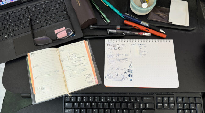
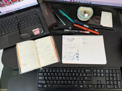
Back in July 2021, I wrote about how I’d just transitioned to a new work notebook, a Mnemosyne notebook from Maruman. When I wrote that post, I wasn’t happy with the size and dot grid and how those were working vs. my desktop space and the size of my handwriting. But I ended up sticking with the notebook for over 3 years, til the very last page!
What fixed it for me was turning the notebook 90 degrees and using it in landscape format. The page header became a blank space on the side where I could doodle (not that this kept me from doodling elsewhere), and I adjusted to (and sometimes ignored) the dot grid.
Now that it’s finished, I kind of love it. I always seem to feel this way about my work notebooks when they’re finished– I use them over pretty long periods of time, so they’re crinkled, messy and full of doodles, and I sometimes have extra notes stapled or taped in. They’re not pretty, but they feel very lived-in, and they’re a memento of actual productivity.
Work notebooks used since 2016
My habits with these notebooks may be changing a little. This year, I started using a smaller paper planner (a Pagem diary I reviewed here) in addition to this larger notebook. The to-do lists moved to that planner, and the Mnemosyne notebook was used more for meeting notes and doodling. I liked having it as a handy scratchpad for my fast scrawls in larger handwriting, vs. my to-do lists, which I write in smaller, tidier handwriting.
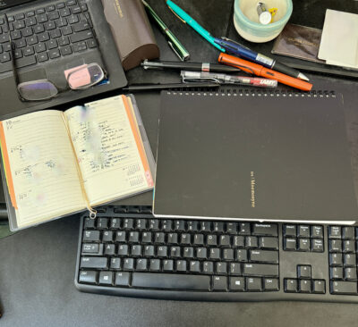
Next year, I’m planning to use one of my pocket sized looseleaf notebooks, probably a Filofax, for my planner and to-do lists. The flexible format should allow me to also write meeting notes in it. But I think I’ll still want to keep a desktop notebook for scribbling. I’ve just started using the Nebula Casual Note I reviewed a while ago– it’s smaller than the Mnemosyne and fits really nicely on my desk. It will be interesting to see how long it takes me to get through it, and how my Filofax planner will work for… my work!
Do you think you can out-geek me? Ha! This post will be a shot across the bow…
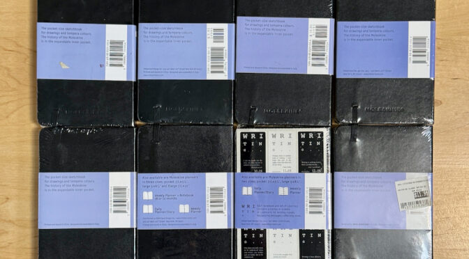
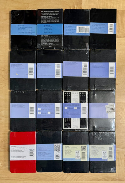
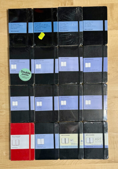
I have a large stash of Moleskine pocket sketchbooks and squared notebooks, as well as a various other formats. In a post from several years ago, I used some of them to trace the evolution of Moleskine’s packaging design .
Moleskine notebooks front
But now I’ve gone further. I took out every single pocket Moleskine sketchbook I own, and sorted them by the design on the front of the paper wrapper. And then I subdivided them even further by the details on the back of the paper wrapper. I found 16 different variations:
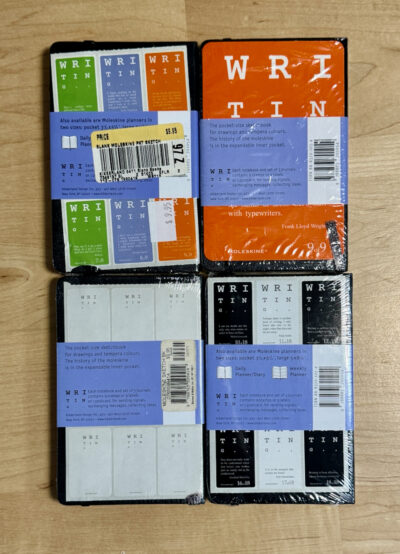
These are organized in what I think would be chronological order, starting at top left and ending at bottom right. In some cases the variation may not be chronological but driven by labeling requirements for certain countries. You can see that they used different ISBNs, slogans, bar codes, etc. in addition to the major design changes. A couple of these are distinguished by an additional card within the shrinkwrap, as seen in the 2001 sketchbook second from top left, and the “Writing” promotion sketchbook with the stickers. The “Writing” promotion actually featured a few different extras, so let’s take this another step that adds 3 additional variations:
And there you have it. Have I made the world a better place today? No. But I’ve satisfied some deeply nerdy desire to analyze and taxonomize part of my notebook collection.
I was reminded of this phrase by a marketing email from Plotter, linking to this post. Techo Kaigi means “notebook meeting,” and the idea is that you should have a meeting with yourself to contemplate your notebooking methods and make sure they are right for you. This is generally done in the fall, when planners for the coming year become available and you can decide whether to change what kind of diary or planner you will buy.
This will be a unique process for each person. For some, it may be a question of finding the one formatted diary or planner that meets their needs, while for others, it may involve reckoning with how you’ll use several different notebooks each for their own purpose. Here are a few examples:
For me, techo kaigi is pretty much a year-round activity! I’m always thinking about all the various notebooks and planners that are out there and how best to use them. But it does come to a head each fall when I’m ready to buy next year’s diary. For several years now, I’ve been very loyal and consistent in using a Nolty diary as my dated planner/logbook for the year. I also keep a pocket Moleskine sketchbook for drawings, and I keep a journal in (usually) a pocket squared Moleskine or a Bindewerk journal.
In the last year or so I have also added a pocket Filofax to my arsenal as a keeper of long term lists, but I’m not entirely sure this is really working for me. I’ve contemplated using it as a planner too, but I can’t give up the Nolty. I have various Filofax organizers and similar looseleaf notebooks that I really like, and I used to use them daily, but for the past 20+ years, I haven’t been able to find a solid place for them in my various routines.
But last year, I made one major change to my notebooking habits, and it’s going to evolve even further this coming year. This involves the notebook I keep for my job, which for decades has been totally separate from my personal notebooks.
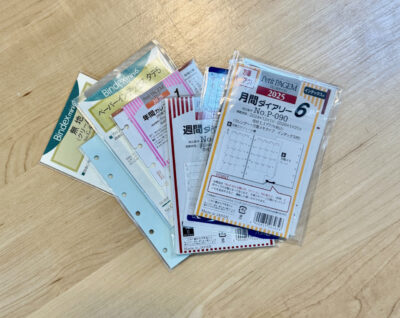
When I placed my annual Nolty order for 2024, I threw in a dated Pagem diary. I kind of just wanted to check it out and review it for this site, but then I ended up liking it so much, I decided to start using it for my job. For years, I’d always used a larger notebook for work, just filling it with notes and to-do lists and moving to a new page when the old one was full. I always thought a pocket sized notebook would be too small for work notes, but my experiment with the Pagem diary this year proved that a small dated planner could work for me. But in other ways, I found the Pagem format constraining, and not adaptable enough to my odd schedule. The light bulb went off: my work notes could be the perfect opportunity to make use of a refillable looseleaf binder. So this time, when I placed my Nolty order, I added some items from their Petit Pagem and Bindex brands of “mini 6” inserts, which will be compatible with my pocket size Filofaxes and other binders. I also have various inserts from Filofax and Plotter that I can use.
So while my personal techo kaigi took me about 5 seconds to say, yep, I’ll do that again, I’m now looking forward to even more strategizing and testing on how I’ll set up a pocket sized looseleaf work planner. I have a couple of calendar formats to experiment with, various options for notes pages, and several appealing options for the binder itself. And what’s wonderful is that I can keep tinkering with it as I go along! Unlike with a bound notebook or planner, I won’t feel like I have to stick with it all year until it’s used up– I can adjust as I go along, and even if I find an insert system that works perfectly, I can change my mind about the exterior cover and move all the inserts into a different binder if I feel like it. This should be fun! Techo kaigi will continue, and I’ll keep you posted!
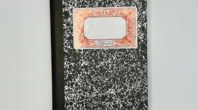
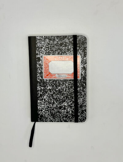
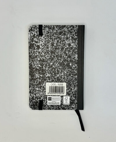
My recent post about the damage to my Miquelrius “Boarding” notebook reminded me that I had another Miquelrius notebook in my review queue: the Miquelrius Logbook.
The Logbook is about the closest Miquelrius comes to a Moleskine clone: it’s a pocket sized 9x14cm hardcover notebook with an elastic closure, a ribbon marker and a back pocket. Various designs have been available in the past couple of years (including a linen-covered version and this version with a cool marbled cover ), though it looks like the most recent catalog on their website just has them in pretty basic plain pastels.
But I was fortunate enough to come across this very cool design, which looks like a vintage composition book. Having a composition book in my favorite size has always been a fantasy of mine, so this was quite exciting! Miquelrius still offers a line called “Vintage Notebooks” that have this kind of cover design, but in larger sizes. The ornate label on the front cover makes it look less like an American-style composition book and more like a traditional European notebook, such as Emilio Braga‘s notebooks, or these Italian notebooks.
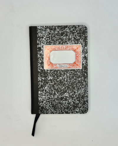
The Miquelrius Logbook is a bit thicker than a Moleskine, giving it a pleasantly chunky feel. The outside is a smooth paper surface– the black spine is just printed on, but the red and white label is an actual pasted-on label. I haven’t tried to remove it, but from tentatively picking at one corner, I don’t think it’s mean to be removable.
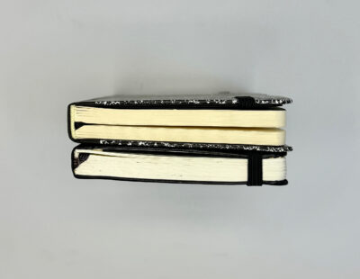
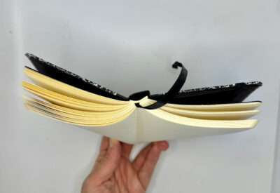
The cover overhang is bigger than I’d like, but not totally out of proportion with the notebook’s dimensions. The spine is quite squared off, so the notebook doesn’t open quite as flat as I’d like. It will get pretty far open, but over time I could see that the corners of the spine might get stressed by this and start to tear.
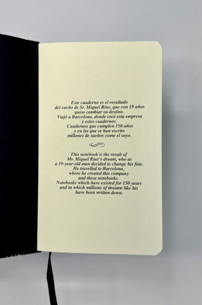
Inside, there are plain black endpapers. The first page has a little blurb about the company’s history, which I didn’t realize went back 150 years.
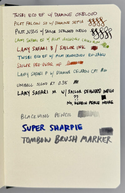
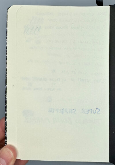
Then you get 100 sheets of creamy, unlined 100 gsm paper– at least according to the label. By my count, it’s actually 96 sheets! Or 192 pages if you count both sides– just like a pocket Moleskine. But unlike a pocket Moleskine, the paper is sturdy and fountain pen friendly! There was only a tiny bit of bleed-through when I pressed down quite hard with a flexible nib (and of course with the dreaded Super Sharpie). The paper is smooth but gives a little feedback– it’s a really nice balance.
This charming Miquelrius Logbook is still listed on Amazon but not currently available. Too bad! It may not be perfect in every respect, but the retro exterior and fountain pen friendly paper make it a winner for me!
Notebooks, journals, sketchbooks, diaries: in search of the perfect page…