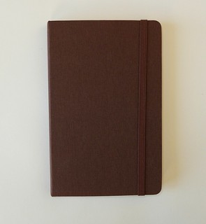
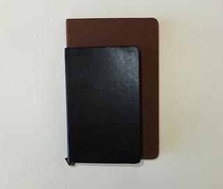
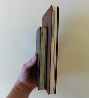
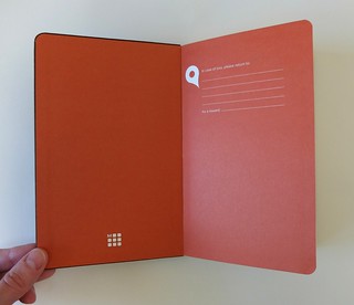
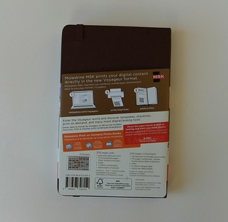
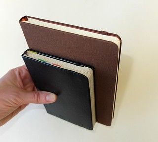
The Moleskine Voyageur notebook was introduced last summer, and so far remains a unique outlier in their product line. It’s an odd size, in between the classic pocket and large notebooks. It has a brown cloth-bound cover. It has a fancy die-cut paper wrapper with a travel-themed collage element. It has colored endpapers. I guess you could say it’s a departure from the norm (pun intended).
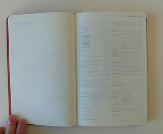
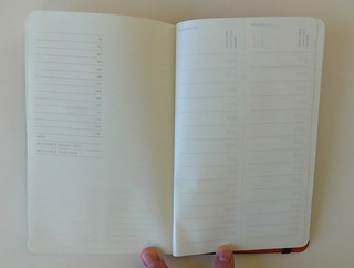
There are other aspects of it that seem like an offshoot of their City Notebook series, which makes sense, given the travel theme. (The City Notebook line has been scaled way back to only the biggest destinations. It’s a shame, but understandable, as they must have been very expensive to produce in the first place, let alone trying to update transit maps as needed. But I love them nonetheless.) There are 3 different-colored ribbon markers, and a section with useful travel info. This part is similar to what is found in many diaries by Moleskine and other brands– dialing codes, time zone map, places to write extensive personal details including loyalty card numbers, etc. There are pages titled “Places to Go” and “Places I’ve Been,” as well as one meant for stamps, and at the end there are perforated packing list and to-do list pages. There is also an index, and a sheet of stickers. In between are numbered pages in 3 sections– lined, dot grid, and plain.
Some of the elements of this notebook sound very similar to the Travel Journal in the Passions series. I haven’t looked closely enough at one of those to really compare it to the Voyageur, but it does make me wonder why they decided to create this other product which would seem to target the same niche. Perhaps the Passions format was seen as being a little too structured, and the Voyageur was aiming at a better balance of pre-formatted vs. blank pages.
And yet… there are a LOT of instructions to this notebook. Before you even open it, you’re being instructed to use the paper wrapper in your travel photos to say “I Am Here,” and hashtag them to connect to “the Moleskine community.” (What does that even mean anymore? It’s like trying to connect to “the Diet Coke community” or “the Nike community.”) Then there’s a whole how-to page telling you to download things and paste them in your notebook, share your travel details in a Flickr group, and turn your snapshots into a Moleskine photo book. It’s a shame so much of this is printed on pages in the notebook itself rather than in a removable booklet.
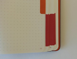
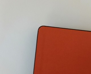
The overall impression is that there’s a lot of elaborate fuss over how to use this “traveler’s notebook for the digital age,” and it’s rather a shame, because A) utter simplicity and blank-slate-ness is what made Moleskine’s notebooks iconic in the first place, and B) when you get past all the fussy stuff, I think it’s actually the best notebook Moleskine has made in years, at least in terms of its construction. The brown cloth cover is lovely. The notebook is beautifully made, with a tolerable degree of cover overhang, everything even and square, and very neatly tucked corners. It’s as if they brought their quality control team out of hibernation for this product. Some of the features, such as numbered pages and an index, have been on Moleskine fans’ wishlists for years, and have driven them to switch to Leuchtturm to get them. I love the extra ribbon markers and the colors they chose for them. I even like the size– it’s not one that I tend to use a lot, but at 4.5 x 7″, it is the same proportion as the pocket notebooks in 3.5 x 5.5″, and that ratio always seems to appeal to me. I like having the sections with different paper types, and how they used different color inks for the page numbers, dots, and lines. The colored tabs along the edges might encroach a bit too much on the page space for some people, but as a design element they are attractive and I like the idea of putting a subject header or date in them, though some inks may bead up on the tabs.
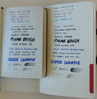
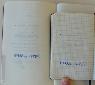
Moleskine paper is the major thing that has driven many fans away, and the Voyageur is no different in that respect– lots of show-through, and bleed-through with quite a few pens. Fine point gel ink pens are ok, though, and fortunately those are what I use day to day. I did a side-by-side paper comparison with one of my old Modo Moleskines– bleed-through performance wasn’t great in that one either, but you can see how much better it was on show-through. The only test where the Voyageur out-performed the older paper was the 5-second stay-in-one-spot test with the Accu-Liner, which spread out more in the Modo notebook.
I bought my Voyageur online— I was intrigued by the description of the features when I first heard about it, but I had my misgivings. It had already been a while since I bought any current-production Moleskines due to the quality issues, though I still snag old Modo & Modo ones from time to time if I come across them. Fortunately, the quality of the Voyageur was a pleasant surprise when it arrived. It has that hard to define “wantability” that would have drawn me to it on a store shelf, and “wantability” is exactly what the rest of Moleskine’s products have been lacking for me the past few years. I don’t know how or when I’ll use this notebook, but I do want to find a way to use it. But just out of orneriness and dislike of redundant instructions, I probably won’t use the Voyageur for anything related to travel! #m_iamnotthere









I used the Voyageur on a trip to Europe last year. I loved the size and the cloth cover, and the fact that it was light enough to toss in a bag without feeling weighed down. It became a convenient place to store the day’s tickets/paperwork.
I did ignore the many, many filler pages of instructions and threw the stupid social media arrow away.
It’s a shame the Moleskine’s dropped in quality, now it seems like having one is more of an embarassment than something all the hype was about when they first came out.
I also agree, saw this notebook in a store and it felt pleasant to hold but all those wasted pages of instructions and such are not worth the price… $24 to be exact!
This is actually my favourite Moleskine. Otherwise I have switched to Leuchtturm and Baron Fig for work and a Midori passport thingy for personal stuff.
However I use the Voyager for my various music projects..
The lined section I use for lyrics, the grid is used of planning arrangements and recording notes and the blank pages are used for sketches of various types (artwork, recording setups etc).
It’s a lovely book from the cover material to the interior details (and as you say the format is lovely too).
Definitely worth a look…
Out of touch with the way most people use a notebook. Trying to combine a notebook with social media is pointless. A notebook, plain and simple is good. For cross references, storage of information and images, use portable digital tools (smartphone or tablet).