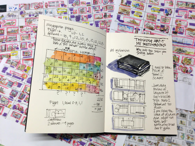
A fascinating blog post about preparing to do a sketchbook and laying out the pages. This method won’t be for everyone, but it’s something I’d like to think about for my next travel sketchbook, as I rarely feel like my sketchbook pages have good composition:
“I approach my sketchbooks like a graphic designer and the larger page size has more possibilities that I haven’t fully explored yet. I spent this evening’s cuppa analysing my layouts for both the SG trip and the Melbourne trip (marking up in different coloured pens the areas of text vs image vs maps. I feel the Melbourne sketchbook’s layout was a little ho hum so trying to work out what pages I like from the SG book….and what the feel I want for this years books.
The long and short of it is that I am going to attempt to fill my sketchbooks according to a 3 column grid (well as a starting point) This might prove to be a silly undertaking but I have always wanted to approach a sketchbook with a ‘book design’ type approach….”
Read more at Liz and Borromini: Trip Prep- Sketchbook thinking.

