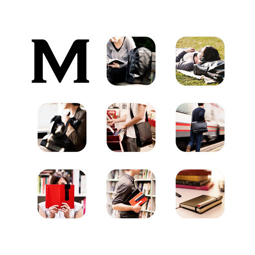
Moleskine’s got a new look, at least for their website and ads. I wonder if they’ll start to use this new concept on the notebooks themselves, or their packaging?
Over the past few years, the company has diversified into areas such as apps and print-on-demand services – and a new identity for the brand created by Milan-based agency Achilli Ghizzardi Associati is built around the concepts of flexibility, organisation and an open space for creative ideas to flourish.
What this translates into in real terms is a monogram of a three-x-three grid of squares featuring the curved corners that have been a notable part of the design of Moleskine’s notebooks. The top-left square is replaced by a capital M from Moleskine’s logo, which has been tweaked from the Copperplate original to create an original face.
Read more at Inside Moleskine’s identity redesign by Achilli Ghizzardi Associati – News – Digital Arts.


I’ve attended meetings where designs like this are presented and then discussed for days. That a company arrives at a usable look and feel after so many unqualified people provide feedback and input is a wonder of modern passive-aggressiveness. My first reaction of this layout is, “The M with 3 squares, maybe. Nine? Too busy. Too many blanks to fill in for every occurance of the mark.”
Wonder if they shall be making square books now?