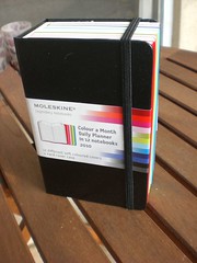
The Moleskine Color-a-Month 2010 Daily Planner has turned a lot of heads this year– it’s certainly the most colorful and unusual product Moleskine has introduced. But what’s inside that chunky rainbow package? Let’s take a look!
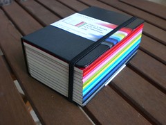
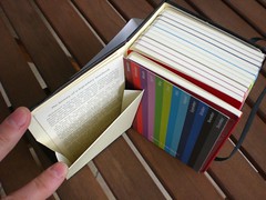
The planner is the size of a pocket Moleskine notebook, but at 2 1/8 inches, it’s about 4 times as thick. It consists of an outer cover and 12 loose booklets inside, one for each month. Inside the front cover, there is a vertical version of the usual expanding pocket usually found in the back of the notebooks.
The funny thing about the outside cover is that the back cover angle is a fixed 90 degrees, while the front cover folds back and forth freely. It just wraps around 3 sides of the inner booklets– I had expected it to have a bottom and function more like those boxes for storing magazines, but the elastic is all that holds the monthly booklets in. I worry that this won’t be very secure over time, as the elastics can lose their tension. The product description on Amazon says “The 12 months are packed in a gift box that protects, organizes, and preserves,” which just isn’t true, as far as I am concerned.
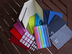
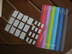
In addition to the 12 booklets, you get a card showing the colors and months, which I suppose could be used as a bookmark, and a sheet of stickers you can use to label the spines.
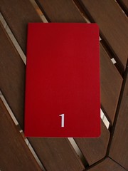
The front of each booklet is already labeled with the number of the month, 1 for January, and so on.
The booklets are just like the Moleskine Volant notebooks— same thin, flexible, slightly shiny cover (not the lighter, matte stock of the Cahiers
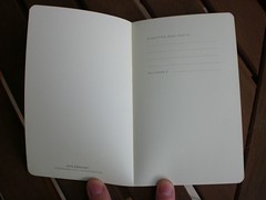
). Inside the front, you get the usual space for writing your “if lost” info, then a more detailed personal info page, and quite a few pages of other information, including time zones, holidays, measurement conversions, a year-to-view calendar, month-per-page planner pages, etc.
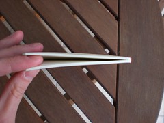
These pages actually take up half of each booklet, to the point I’ve marked below:
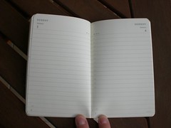
Only after that do you get to the per-day pages:
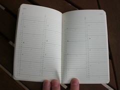
The daily pages have the usual layout found in Moleskine’s other daily planners, with hours of the day noted along one edge.
If I had designed this product, I would have done a few things differently, as noted in this post: I would put the front-matter of the monthly booklets into a separate booklet of its own, rather than repeating it 12 times. Then the monthly booklets could either be thinner, or have a 2-page spread per day. I also might have made it an undated calendar, so the user could choose which color booklet to assign to each month. Personally, I think January and February should be grey and November and December should be red, rather than vice versa, but perhaps that’s just my geographic and cultural biases showing!
What about usability? Is it handy and does it work? It depends. I think separate monthly booklets are great if you want to create a backwards-looking diary, but probably not so convenient if you want a forward-looking planner. Are you going to carry all 12 with you? Or the current month plus the next month or two? What if you need to note an appointment a few months from now? You can note it in the yearly planner at the front, but there’s not much room, and you’d have to transfer the info to a different month’s booklet later. That would drive me crazy.
But I don’t use a paper planner for that kind of scheduling anyway– that’s where I’m all electronic. I use paper, currently a Moleskine weekly planner/notebook (week on one page, notes page facing), to keep a diary, or more like a log book. I record what I ate, what exercise I did, my health, any interesting dreams I had and other little details of daily life (but not longer journal entries, which I keep elsewhere). I don’t carry this notebook around with me, so sometimes I have to go back and fill things in after being away from home. This works pretty well, but next year, when I start using the Color-a-Month booklets, I’ll carry around the current month. It will be nice and light, and I’ll have lots more space for each day. I’m hoping it will encourage me to add more detail about each day’s activities and thoughts, or perhaps keep more of an art journal. (I wish it would look like this one!)
Bottom line, this is a great-looking product that no Moleskine collector will be able to resist. I like it and will be using it starting January 1, 2010. But depending on how you like to use a planner, it might not be right for you. And even if it is practical for your purposes, you might wish a few of the details were a little different. I also have to note that at a list price of $40.00, it’s not cheap! (I purchased the planner I reviewed when it was deeply discounted at Amazon, otherwise I think I would have waited and hoped to receive it as a Christmas present!) It will be interesting to see if Moleskine continues to offer it for 2011 and beyond, or whether they’ll consider it a one-off and try something else next year.
You can get one via Amazon here, currently 10% off at $36.00.
CONTEST HAS ENDED. Or, you can try to win one in my latest giveaway! Thanks to the friendly people at Moleskine’s US distributor, Chronicle Books, I now have a couple of these planners to give away, plus some other Moleskine goodies.
Prizes awarded to 3 randomly selected winners will be:
Prize package #1: Moleskine Color-a-Month 2010 Planner & Pocket Ruled Notebook
Prize package #2: Moleskine Color-a-Month 2010 Planner & Pocket Ruled Reporter Notebook
Prize package #3: Moleskine 2010 Desk Calendar & 2 Large Ruled Volant Notebooks (blue covers)
There are two ways to enter:
- Follow me on Twitter @notebookstories AND post this message as a Twitter update: Win a #Moleskine planner this week @notebookstories http://bit.ly/8SkKII
- If you have a blog, write a post linking to this review and email me your blog post URL at contest@notebookstories.com
Deadline to enter is Friday Dec. 4th at midnight. Good luck!



I’d love one and yet couldn’t spend £35 on one. It really is an extravagance too far. Obtaining one in a giveaway however is entirely different…
The discounted price you spoke about was much more acceptable and I suppose they might be a few bargains around if they don’t sell. A good concept, not quite thought through and way too pricey.
Thanks for the review
Thanks for the review.
Uncontrolled front matter is a waste of paper.
If Molie had released a lovely little binder system for this product I think it would be useful. It would need to hold three booklets.
david boise ID
Thank you for the review! I haven’t used moleskine yet but am always looking at them. I’ve tweeted this @CinderLisa and @tiemeinbows. :)
I’d love to win one too. I like the small colour-a-month system, though I wouldn’t mind a bigger one as well, with more pages and using the large Volant books.
Awesome giveaway! Thanks for all the reviews. I tweeted about this at janedoe76 and became a follower.
Great post very informative. I would love to win and have tweeted this @DTSD
Have been following you for some time. Look forward to all the updates. Have a great day.
The folks at DayRunner how offer a cute binder that holds their one-month-at-a-time calendars and accessories in a system called LifeTracker.
http://www.dayrunner.com/webapp/wcs/stores/servlet/category3_10053_10004_63702_-1_Y_63701_10053_Y
After waiting excitedly for the past couple months, I started using mine promptly on January 1st and now I’m not sure if I like it or not. I’m not used to such a tiny format. I agree with you that they should’ve put those personal and other pages in to it’s own little booklet instead of putting it in each one of the monthlies.
I’ll try to stick with it and see if the format grows on me.
Hello
I am looking for backdated blank notebook/journals for years 2010-2013. Any ideas were to acquire such a thing?