Andrew Motion, the poet laureate of Britain, was interviewed recently and I noticed this remark:
My notebooks are Ordning & Reda from Selfridges — blank pages for poetry, lined for prose.
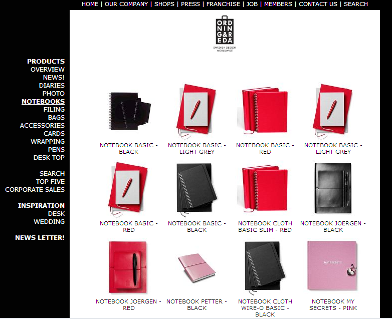
I’d never heard of Ordning & Reda so I had to investigate, of course! Here’s their website: www.ordning-reda.com. Now is it just me or is their website really dumb? The “notebooks” tab features lots of images but when you click through, there’s not much info.
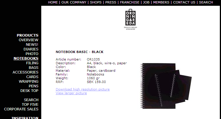
Take, for instance, the “Notebook Basic– Black” at the upper left. Looks like it comes in 3 sizes, but when you click through, it just tells you it’s A4 size.
No link to the other available sizes, and no actual measurements for those of us in countries where the term “A4” tends not to be used. (See here for a chart of paper sizes.) There’s not much other info: it doesn’t even tell you whether the paper is lined or not. There’s something else called “Notebook Basic– Black” further down the page, but it’s a different kind of notebook, not spiral bound, and again seems to only offer one size rather than the two pictured.
I lose patience fast with things like this– this company looks like they could have some nice products but for me anyway, I don’t think they’re nice enough to be worth the hassle!


I agree. Many a notebook site have painfully lacked information (plus many being annoying flash animations for navigation.). On the other hand, one thing I can’t bash them for is referring to it as A4. That’s like a US company referring to a notebook as “8.5×11” (imagine that we referred to it by something other than its dimensions). For everyone else, it’s reflexive.
It looks as if Bodum in NYC may have the notebooks if anyone is in town and near 14th Street and might be able to report back on size and appearance.
http://www.timeout.com/newyork/venues/meatpacking-district/11696/bodum