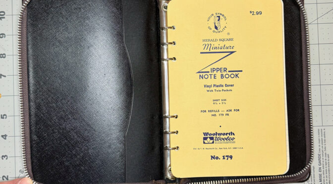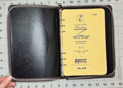
I don’t think I’ve ever written about this notebook, which is a surprise. I fell hard for the Nava Memoria 1992 diary the minute I saw it. It was sold in a store I was working at then, and since I had just been promoted, I made the case that I needed this diary to stay on top of all my new responsibilities in the coming year. I’m pretty sure my boss agreed to let me have it for free, or maybe at the extremely high post-calendar season discount it would eventually have been offered at if no one had bought it by February or so.
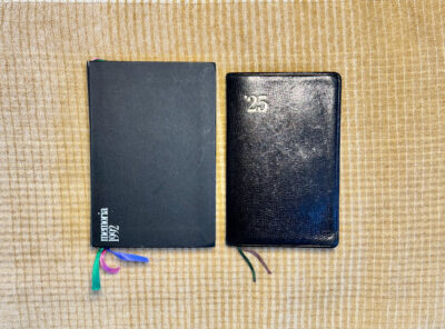
I just loved this diary– at 4×6″, it’s a little larger than the size I’ve come to prefer, but it had a lovely chunkiness to it, and the design was so modern and cool and colorful compared to anything else I’d ever seen at that time.
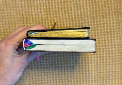
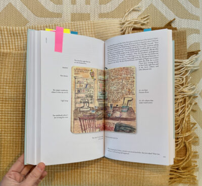
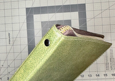
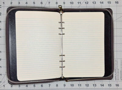
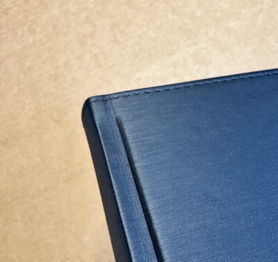
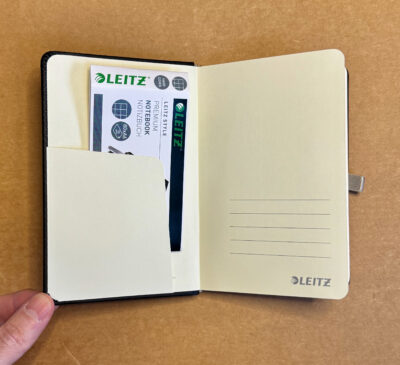
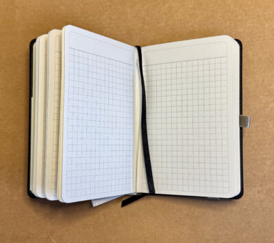
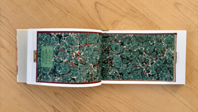
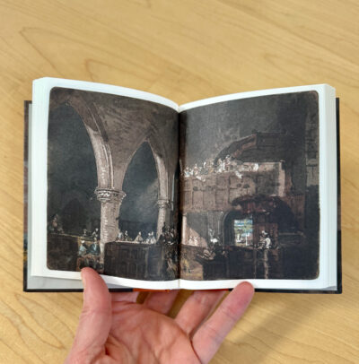
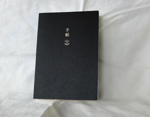
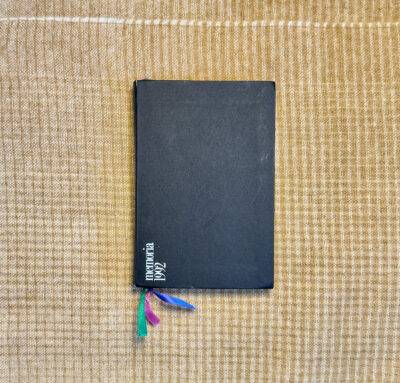
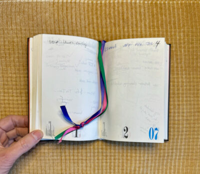
The cover is a matte black vinyl of some sort, wrapping thin and flexible boards. There’s no huge overhang, and the squared corners are nicely made. Inside, bright red endpapers, with a little clear plastic pocket in the front. The 3 bright-colored ribbon markers are another fun touch.
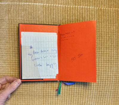
The first page shows the contact information for Nava Design in Milan, and notes that it was designed by Kuno Prey and printed in Italy.
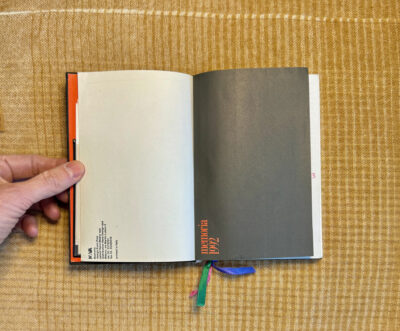
The front of the diary has alphabetical pages for keeping track of contacts, then a month-per-page section noting holidays by country. The holiday details are given in English, Italian and Spanish.
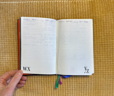
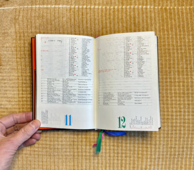
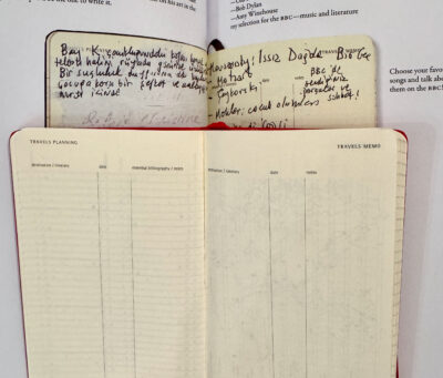
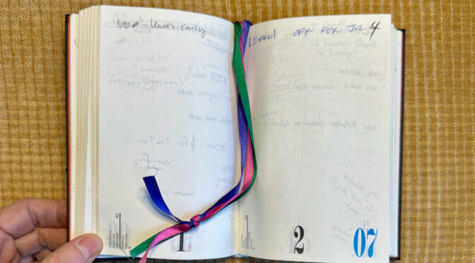
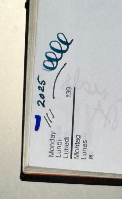
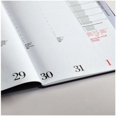
Then the rest of the diary is page-per-day. Here you get the day names in English, French, Italian, German, Spanish and Japanese. It also numbers the days of the year and has little moon phase icons. The date number is black (or red if it’s a holiday), and the month numbers cycle through pink, purple, blue and green. I loved that the pages were unlined, completely free-form other than the info at the bottom.
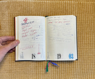
I only used ballpoint pens at the time, but I tested one of the Uniball Signo RT 0.38 gel ink pens that I use today, and it felt amazing on this paper. What I shame I didn’t have them back then! I also did a tiny fountain pen test, and the smooth white paper makes ink look very vibrant, but I suspect many wetter fountain pens would bleed through as mine did. Show-through is about average for relatively thin paper like this (no weight was specified).
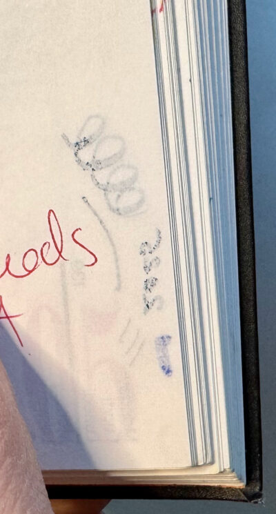
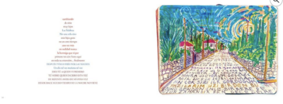
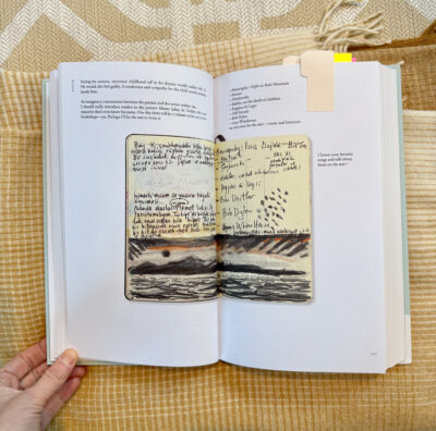
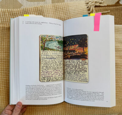
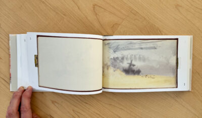
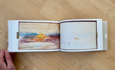
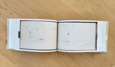
My scribbles are messy throughout– scrawled to-do lists for myself, tasks I had to assign to others, numbers of people to call, notes about when people were on vacation and times of appointments. I also wrote myself a lot of questions about things I needed to learn about my job and how certain procedures had to be done at the store. This was my first “real” post-college job, and while I don’t remember the significance of every single note, I remember the feeling of trying to master a ton of information and feeling very busy. I did learn a lot in a short time and was very good at that job– so much so that they promoted me to a more stressful one less than two years later. But alas, the store never carried this diary again.
Nava Designs still exists, and still makes a similar diary — at least I think it is an equivalent model, as it says they have been making it since the 1970s. The construction looks different, though. And I can’t tell what size it is– I found a listing where weight is the only “dimension” specified. Even their Instagram doesn’t show the Day by Day diary with any context for sizing. Nava also makes a weekly diary where you can see that many of the design elements have remained similar over the years.
My last entry in this diary was on Dec. 8, 1992. In those days, before internet shopping, retail stores were insanely busy between Thanksgiving and Christmas, so I probably didn’t have time to write anything down. The following year, I would have been using my first pocket Filofax, so I probably kept my calendar and lists in there– but if I did, I must have gotten rid of the calendar. My archived Filofax calendar inserts start in 1995, so there’s a two year gap. The Nava Memoria 1992 seems to be the last bound, dated diary I used before moving to Filofax calendars, then Palm Pilots, then trying a couple of Moleskine diaries in the early 2000s, and finally my adoption of the Nolty diary in 2018. Today, I’m not sure I’d buy the Nava diary as I’ve found I prefer the smaller 3.5 x 5.5″ format, but if the quality and design were the same as the 1992 model, I’d be seriously tempted.